LOGO DESIGN
LINK
Link is an application that connects homeowners with service providers such as carpenters, plumbers, and electricians. The logo’s letter connections symbolize the concept of linking — visually reinforcing the app’s mission to connect people and services seamlessly.
BEEYOUNIQUE
Beeyounique is a woman-owned company in South Florida that rents out vintage Italian Ape Piaggio carts for events and brand activations. “Ape” means “bee” in Italian — the logo celebrates this concept of a hardworking hive led by a queen bee.
BCN - 10
BCN-10 was a Barcelona-based blog that shared tips and experiences around the city for less than 10 euros. The logo’s playful typography and dynamic motion of the “-10” symbol reflect the concept of accessibility, energy, and fun city living.
DOSIMETRY NETWORK
Dosimetry Network is a platform that connects oncologists with radiologists. The logo represents that vital connection between key medical points, using clean lines and cool tones that evoke hygiene, precision, and health.
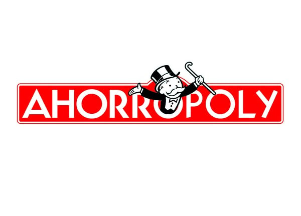
AHORROPLY
Ahorropolly was a financial education program created for Banco Sabadell in Spain to promote saving habits through a game-inspired experience based on Monopoly. The logo was a creative reinterpretation of the Monopoly identity, redesigned to reflect concept.
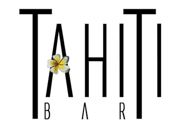
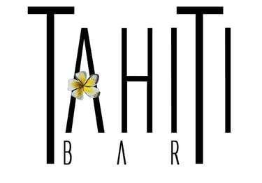
TAHITI BAR
Tahiti Bar was a lounge concept in Venezuela designed to offer a relaxed yet elegant atmosphere. The logo reflects this duality — sophistication through a sleek, elongated sans-serif typeface, and a laid-back island vibe through the use of a tropical flower.
THAMARA PEREZ' PORTFOLIO
Explore my creative journey through stunning designs.
© 2025. Thamara Perez All rights reserved.
ABOUT ME
MY WORK
CONTACT ME
